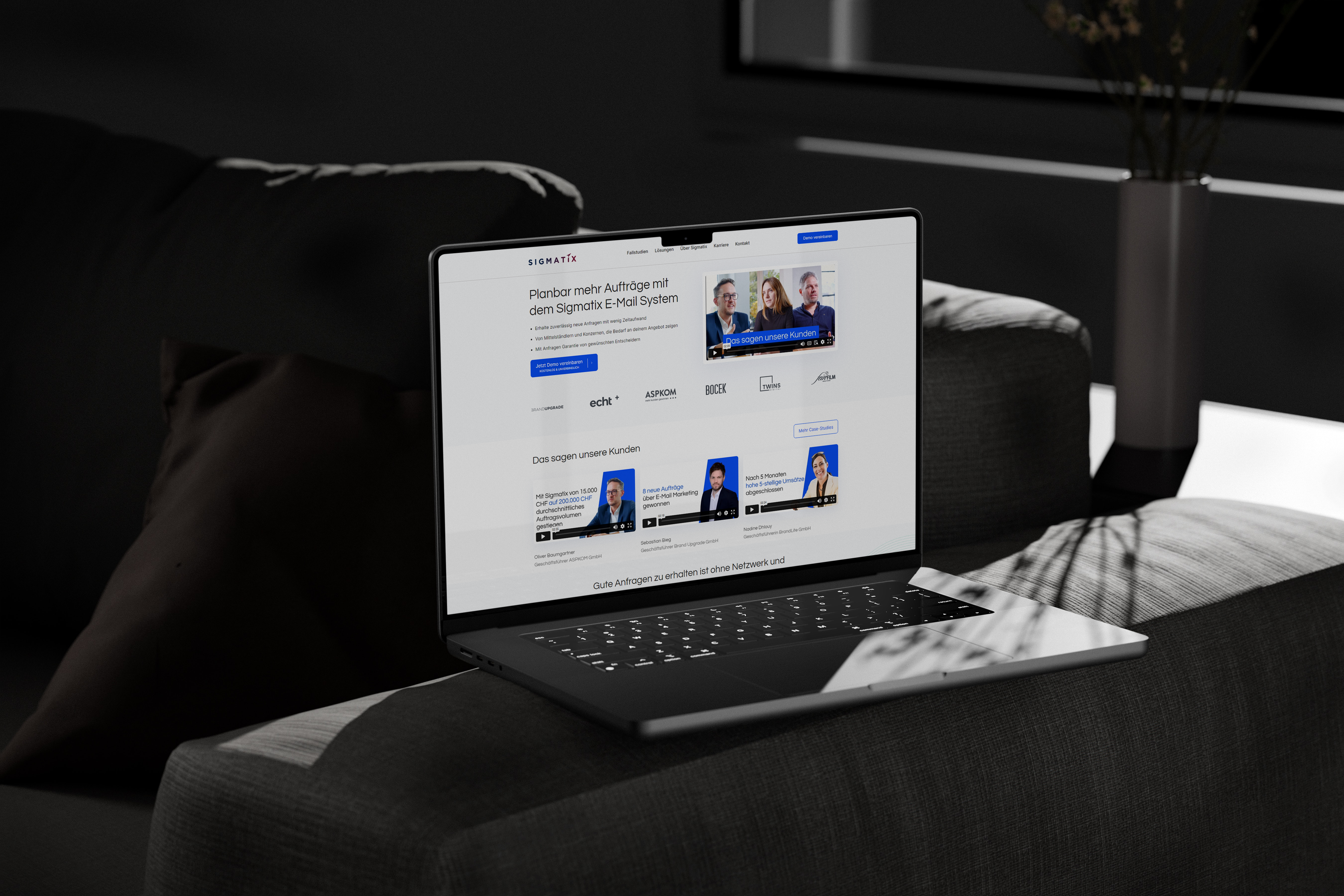
Sigmatix: Elevating Client Base to Upscale Sector with $100k+ Revenue Companies
Sigmatix, the Cold E-Mail experts in Germany, engaged us to revamp their website’s UX/UI, boost site performance, and redefine their brand tone. This transformation resulted in a marked improvement in leads and help acquire better quality clients.
Industry: Cold E-Mail Services
Services: Workshops, UX/UI Design, Web Development, QA, Project Management, Automatizations, Support
Platform: Corporate Website
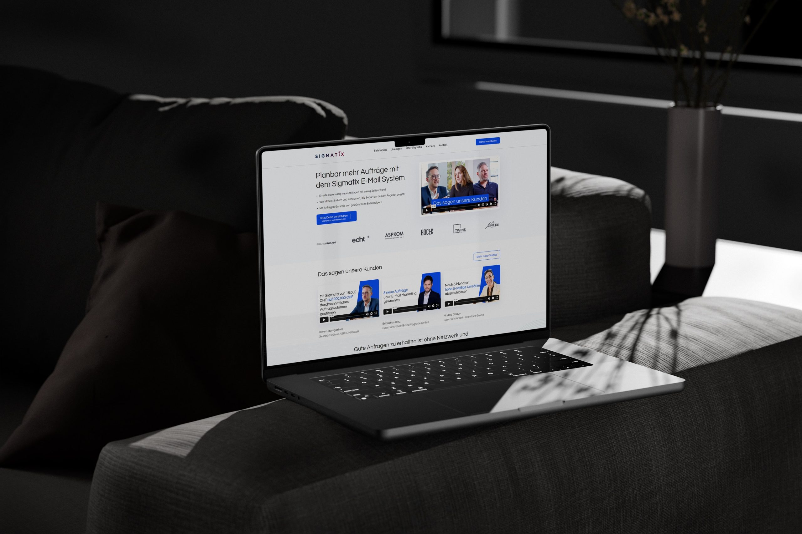
Background
Sigmatix is a well-known company in the German market, operating in the DACH region. As their clients base & quality grew, they needed an upgrade to their website. We decided to take on this challenge.
Mission
- Make a brand that will be visible by higher quality clients.
- Establish a new brand style and design system.
- Analyze user behavior, create wireframes and information architecture.
- Optimize UX/UI design elements for a seamless browsing experience.
- Implement advanced SEO strategies for online visibility.
Outcome
- Increased revenue, clients base, hires and general company growth.
- Improved brand recognition and consistency with a new brand style and design system.
- Streamlined user journey and conversion paths with wireframes and prototypes.
- Increased online visibility and organic traffic through advanced SEO strategies.
Partnering with Hyroes was a strategic move for our business. CEO Alex's direct involvement ensured that our project received the utmost attention to detail and expertise. Their commitment to quality and personalized guidance was instrumental in achieving our goals.
John Harder
CEO, Sigmatix
Phase One: Workshops, Analysis, and Design
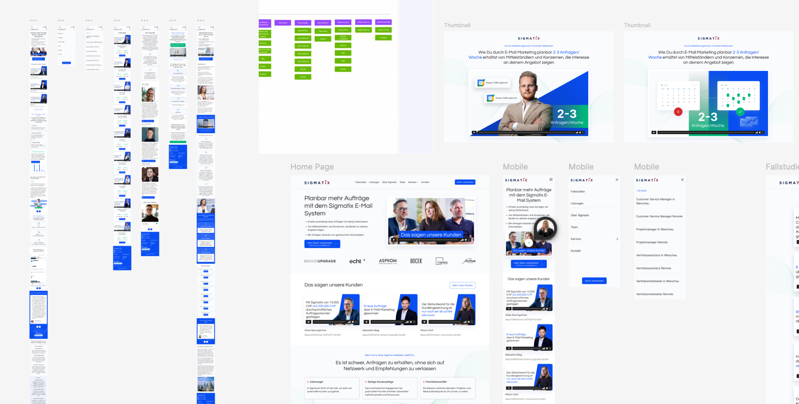
Our partnership commenced with intensive workshops and a comprehensive analysis. We conducted discovery sessions to understand the client’s needs, followed by market and user research. This phase included collaborative design brainstorming to establish a strong brand identity and cohesive design system.
Workshops & Briefing
Conducted interactive workshops with the client’s team to understand their vision, goals, and expectations. Gathered detailed briefs to align on project objectives and scope.
Business Analysis & Identifying Needs
Performed a thorough business analysis to identify the client’s needs and existing pain points. Mapped out current challenges and opportunities to tailor our approach effectively.
Low-Fi Wireframes & Information Architecture
Developed detailed user personas to represent key segments of the client’s audience. Created a sitemap to organize the website’s structure and designed low-fidelity wireframes to outline the layout.
High-Fidelity Wireframes
Transformed low-fi wireframes into high-fidelity versions, adding visual details and interactive elements. Ensured the design was aligned with the brand’s identity and user experience goals.
Documentation Preparation
Compiled comprehensive documentation outlining the design, user personas, sitemaps, wireframes, and information architecture. Provided detailed guidelines to ensure seamless implementation.
Key Conclusions and Steps Performed
- Make everything minimalistic with just a little new styles. Brand should be friendly but more corporate.
- Enhanced user flow and service differentiation: Our efforts were directed towards simplifying user flow and clearly distinguishing services to cater to the varied needs of the company’s clients. This involved a comprehensive overhaul of the UX structure, ensuring each service was presented distinctly and comprehensibly.
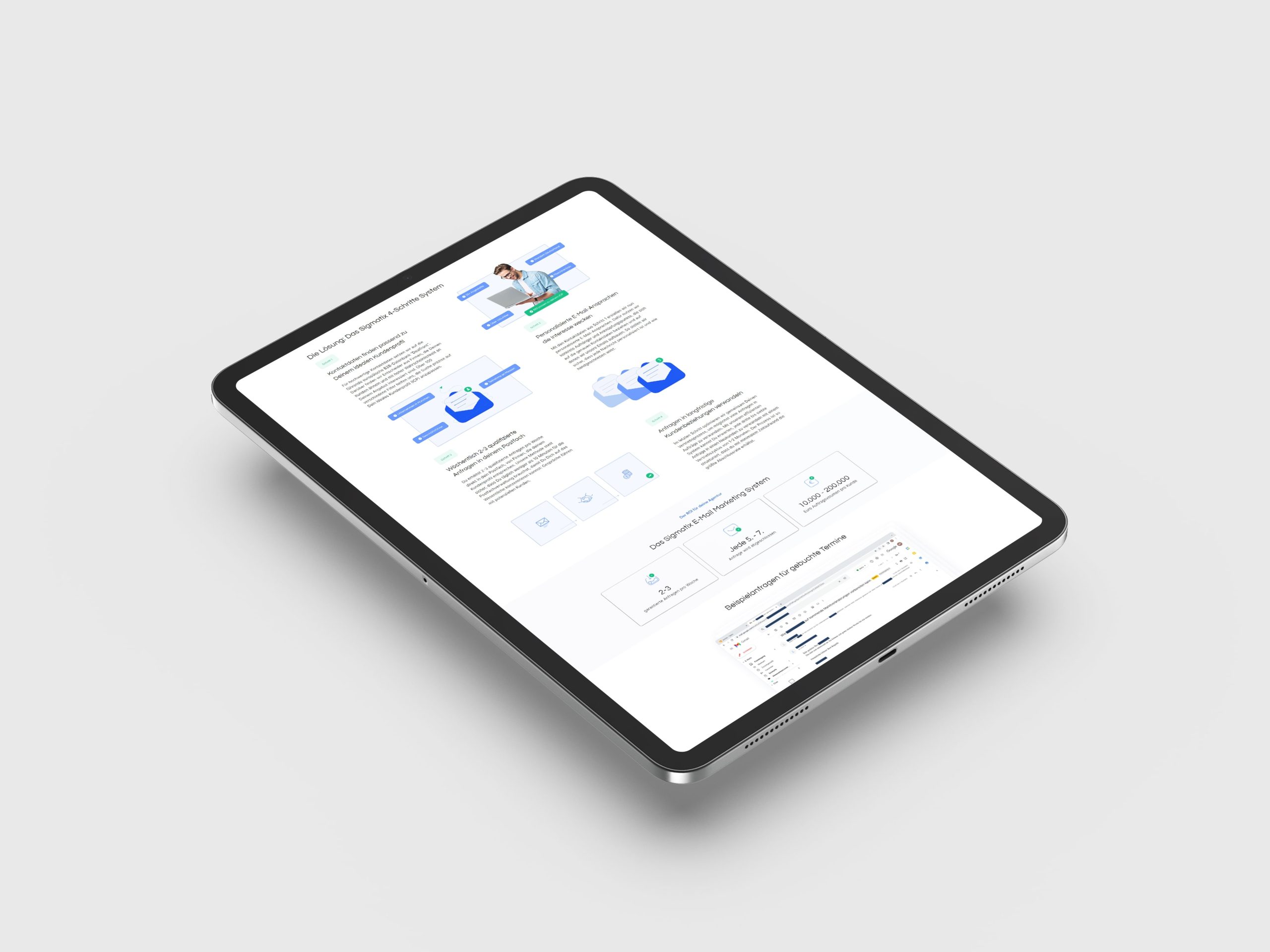
- Revamped branding for industry appeal: Understanding the challenging landscape of the industry, we embarked on a journey to revamp the website’s overall look and branding. Our aim was to create a visually appealing interface that not only enticed users but also conveyed a sense of simplicity and efficacy in solving complex problems.
- Optimized UX content for SEO: In line with modern digital practices, we meticulously optimized the website’s UX content to enhance its visibility on search engines. By integrating SEO best practices into the UX design, we aimed to improve the website’s ranking and attract relevant traffic to the client’s services.
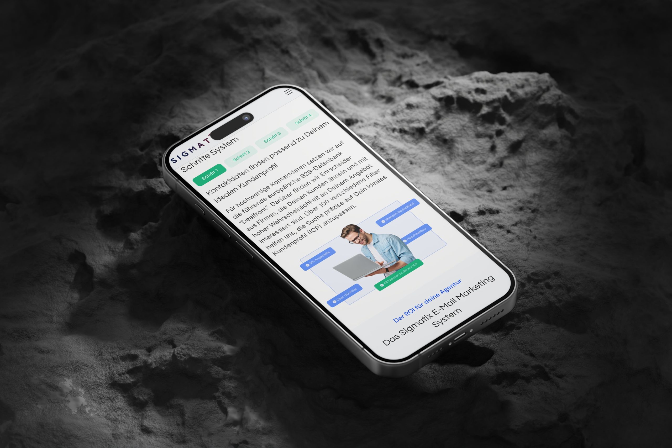
Phase Two: Development, Testing, and Ongoing Support
The client’s vision for an easy-to-edit and manage website, along with the requirement for flexibility in content creation, prompted our choice to utilize WordPress and integrate the Elementor plugin. This decision empowers seamless content creation and facilitates effortless reuse of blocks across different subpages.
Development Kickoff
Commenced the development phase after finalizing the design and obtaining client approval. Set up the development environment and established communication channels for seamless collaboration.
Frontend and Backend Development
Conducted frontend and backend development based on approved designs and specifications. Implemented robust coding practices to ensure functionality, responsiveness, and scalability.
Quality Assurance and Testing
Conducted rigorous quality assurance and testing processes to identify and resolve any bugs or issues. Ensured compatibility across multiple devices, browsers, and platforms for optimal user experience.
Deployment and Launch
Prepared for deployment and launched the website following thorough testing. Implemented deployment strategies to minimize downtime and ensure a smooth transition to the live environment.
Ongoing Support and Maintenance
Provided ongoing post-launch support to address any issues, implement updates, or optimize performance. Offered training sessions for client teams to ensure they manage the platform effectively.
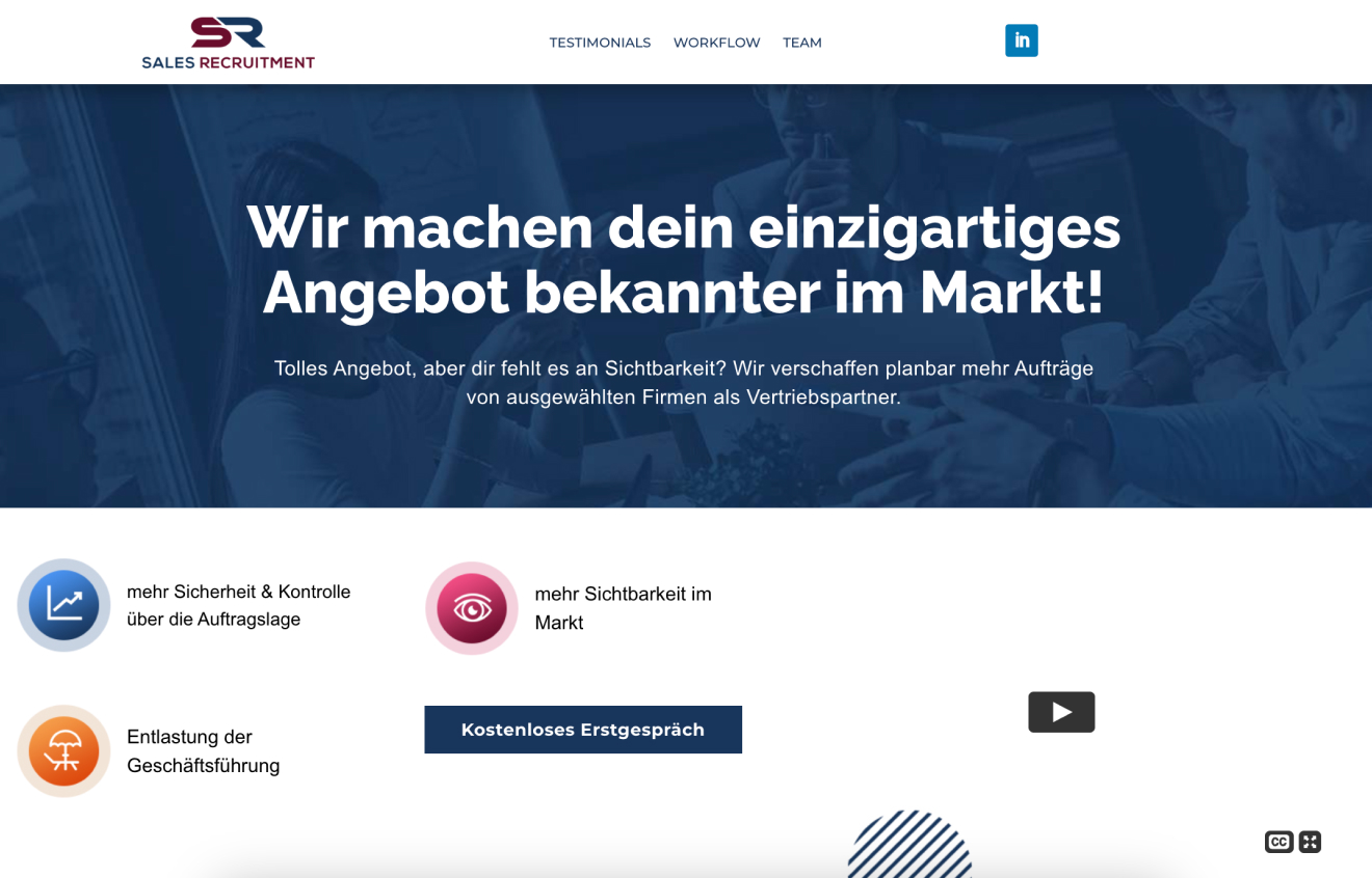
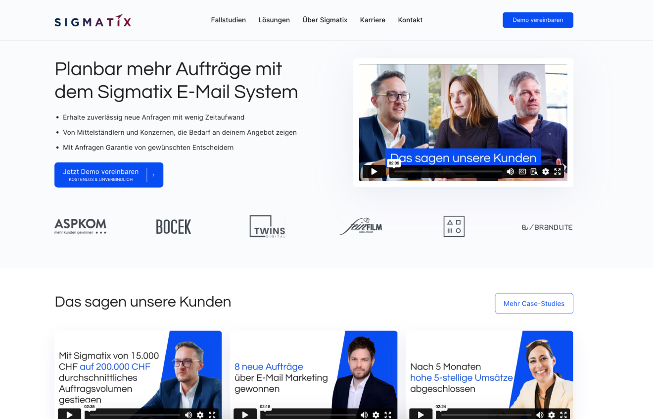
Before
Key Conclusions and Statistics
- Enhanced User Experience: Through meticulous development efforts, we achieved a significant enhancement in user experience, resulting in smoother navigation and increased engagement.
- Improved performance: Our development interventions led to notable improvements in website performance metrics, including faster load times and reduced bounce rates.
- Optimized responsiveness: By implementing responsive design principles, we ensured seamless accessibility across various devices, enhancing the overall user experience.
- Strengthened security measures: Robust security protocols were implemented to safeguard the website against potential threats, ensuring data integrity and user privacy.

"Working with Alex was very pleasant. Fast feedbacks, professional service and quality of work. Will definitly hire him again for more wordpress projects."
John Harder
CEO, Sigmatix
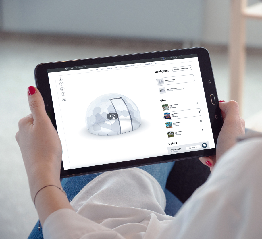
HypeDome: Optimizing Product Personalization through AI Configurator
