Environet: Enhancing Leads Quantity and Quality Fivefold
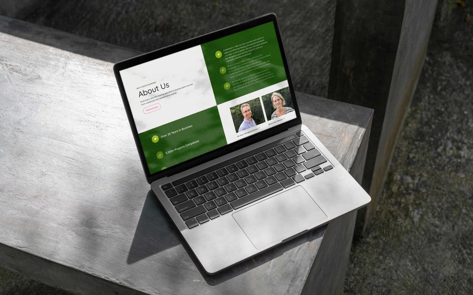
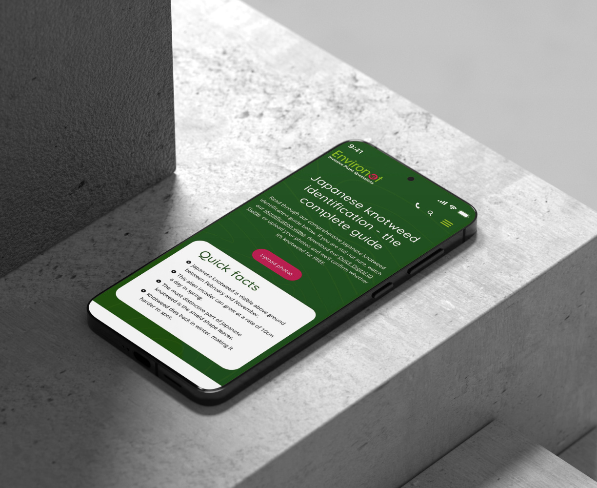
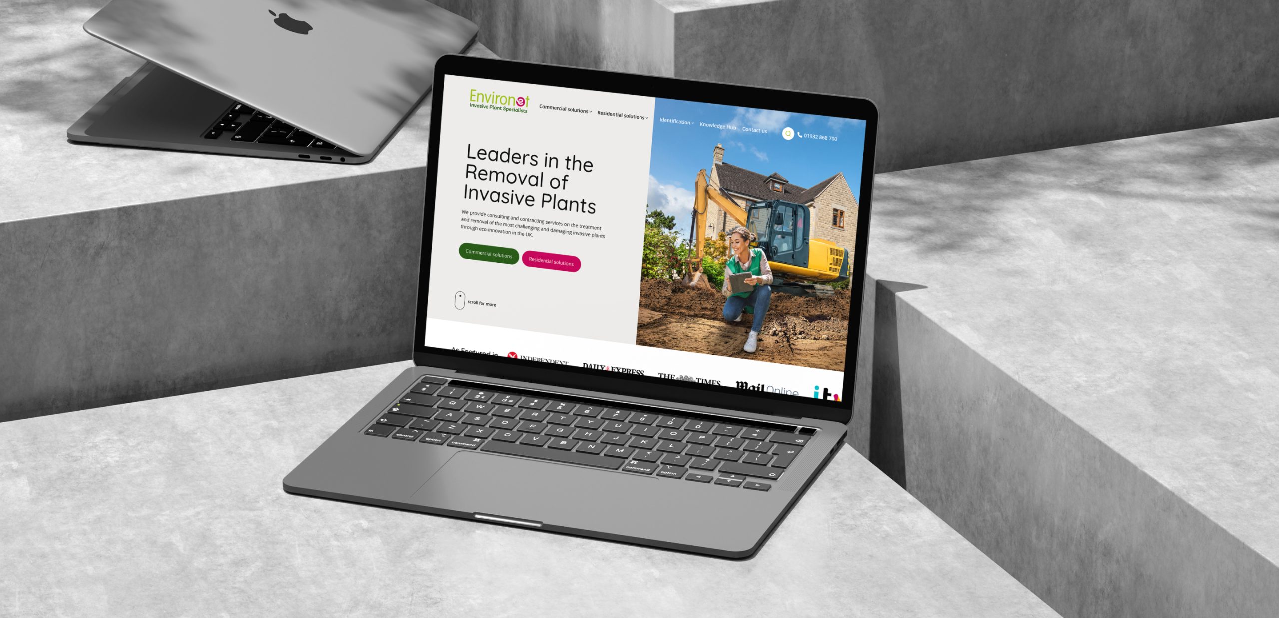
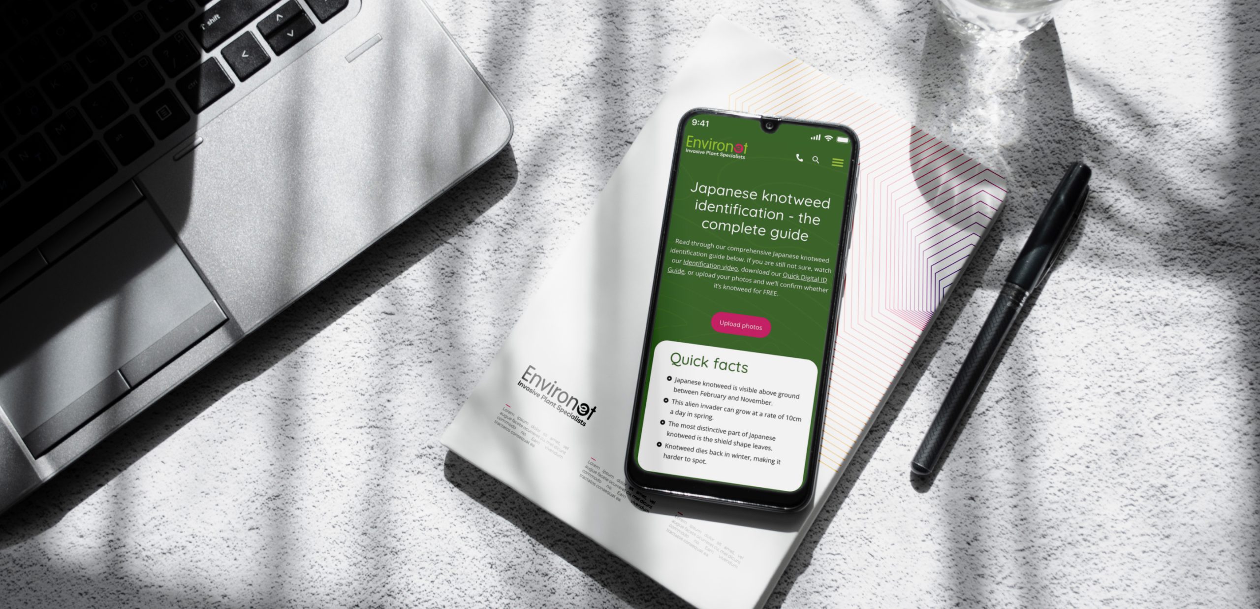
Environet, the UK’s premier invasive plant removal expert, engaged us to revamp their website’s UX/UI, boost site performance, and redefine their brand tone. This transformation resulted in a marked improvement in leads and SEO performance.
Services: Workshops, UX/UI Design, Web Development, QA, Project Management, Search Performance Optimization, Support
Platform: Corporate Website
Background
EnvironetUK, an esteemed industry leader with a 50-year legacy, recognized the need to refresh their dated Drupal website. Seeking to revitalize their online platform, they engaged our team to redesign their website.
Mission
- Collaborate closely with the Environet team to identify needs and address concerns.
- Establish a new brand style and design system.
- Analyze user behavior, create wireframes and information architecture.
- Optimize UX/UI design elements for a seamless browsing experience.
Implement advanced SEO strategies for online visibility.
Outcome
- Enhanced user experience through optimized design elements and intuitive navigation.
- Improved brand recognition and consistency with a new brand style and design system.
- Streamlined user journey and conversion paths with wireframes and prototypes.
- Increased online visibility and organic traffic through advanced SEO strategies.
The website Alex and his Team designed is user-friendly and elegant. Alex was responsive at all times and communicated daily through virtual meetings and email or a messaging app. The website is beautiful, and much easier to use.
Elise Hollinshead
Marketing Manager, Environet
Phase One: Workshops, Analysis, and Design
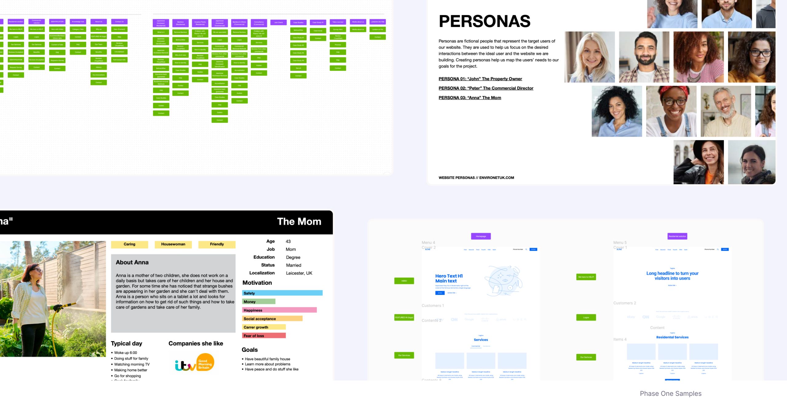
Our partnership commenced with intensive workshops and a comprehensive analysis. We conducted discovery sessions to understand the client’s needs, followed by market and user research. This phase included collaborative design brainstorming to establish a strong brand identity and cohesive design system.
Workshops & Briefing
Conducted interactive workshops with the client’s team to understand their vision, goals, and expectations. Gathered detailed briefs to align on project objectives and scope.
Business Analysis & Identifying Needs
Performed a thorough business analysis to identify the client’s needs and existing pain points. Mapped out current challenges and opportunities to tailor our approach effectively.
Low-Fi Wireframes & Information Architecture
Developed detailed user personas to represent key segments of the client’s audience. Created a sitemap to organize the website’s structure and designed low-fidelity wireframes to outline the layout.
High-Fidelity Wireframes
Transformed low-fi wireframes into high-fidelity versions, adding visual details and interactive elements. Ensured the design was aligned with the brand’s identity and user experience goals.
Documentation Preparation
Compiled comprehensive documentation outlining the design, user personas, sitemaps, wireframes, and information architecture. Provided detailed guidelines to ensure seamless implementation.
Key Conclusions and Steps Performed
- Simplified website navigation: Recognizing the need for ease of use, we focused on streamlining website navigation to ensure a seamless experience for the client’s team.
- Enhanced user flow and service differentiation: Our efforts were directed towards simplifying user flow and clearly distinguishing services to cater to the varied needs of the company’s clients. This involved a comprehensive overhaul of the UX structure, ensuring each service was presented distinctly and comprehensibly.
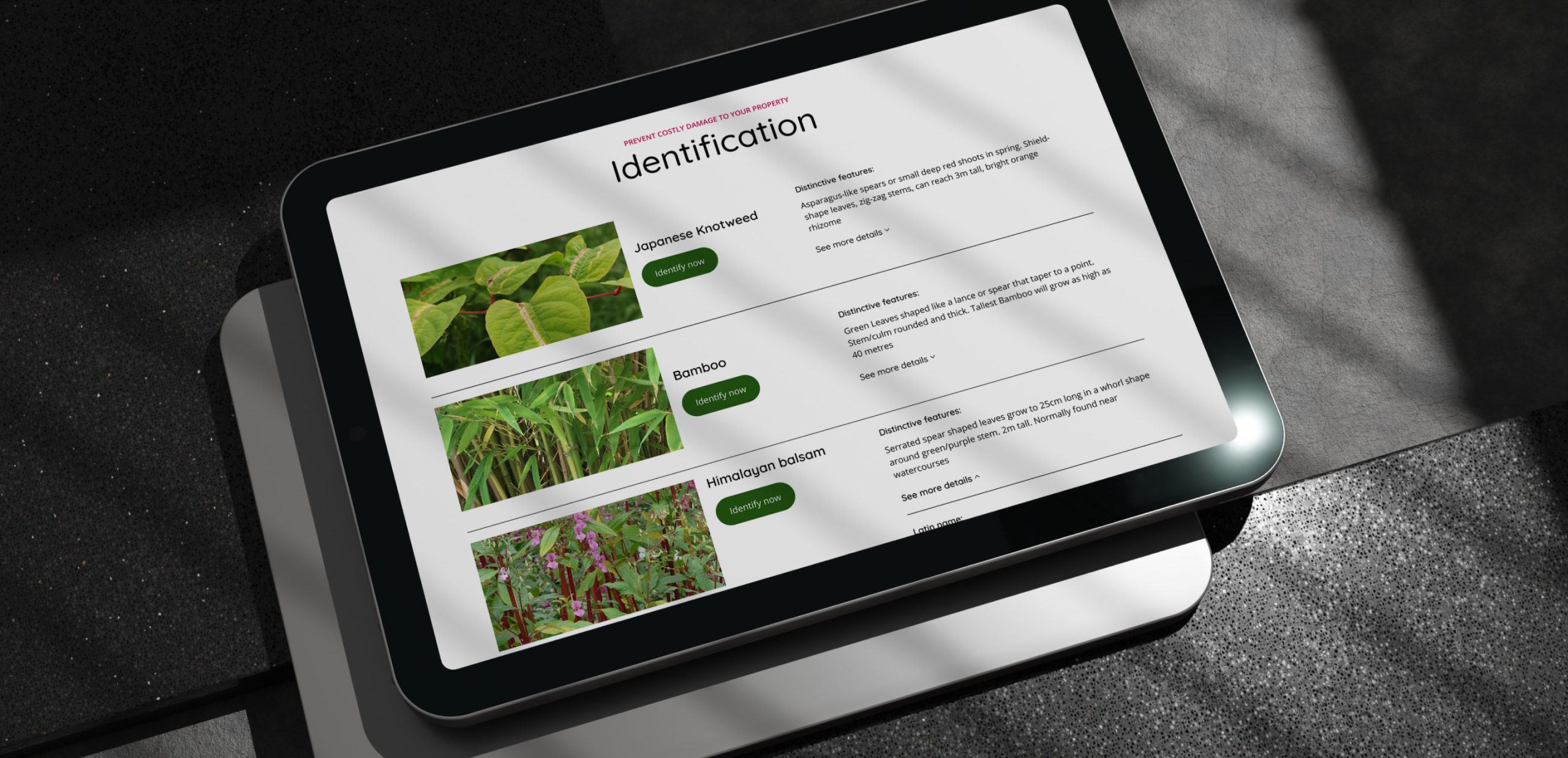
- Revamped branding for industry appeal: Understanding the challenging landscape of the industry, we embarked on a journey to revamp the website’s overall look and branding. Our aim was to create a visually appealing interface that not only enticed users but also conveyed a sense of simplicity and efficacy in solving complex problems.
- Optimized UX content for SEO: In line with modern digital practices, we meticulously optimized the website’s UX content to enhance its visibility on search engines. By integrating SEO best practices into the UX design, we aimed to improve the website’s ranking and attract relevant traffic to the client’s services.
Phase Two: Development, Testing, and Ongoing Support
The client’s vision for an easy-to-edit and manage website, along with the requirement for flexibility in content creation, prompted our choice to utilize WordPress and integrate the Elementor plugin. This decision empowers seamless content creation and facilitates effortless reuse of blocks across different subpages.
Development Kickoff
Commenced the development phase after finalizing the design and obtaining client approval. Set up the development environment and established communication channels for seamless collaboration.
Frontend and Backend Development
Conducted frontend and backend development based on approved designs and specifications. Implemented robust coding practices to ensure functionality, responsiveness, and scalability.
Quality Assurance and Testing
Conducted rigorous quality assurance and testing processes to identify and resolve any bugs or issues. Ensured compatibility across multiple devices, browsers, and platforms for optimal user experience.
Deployment and Launch
Prepared for deployment and launched the website following thorough testing. Implemented deployment strategies to minimize downtime and ensure a smooth transition to the live environment.
Ongoing Support and Maintenance
Provided ongoing post-launch support to address any issues, implement updates, or optimize performance. Offered training sessions for client teams to ensure they manage the platform effectively.
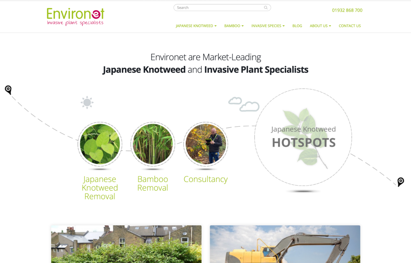
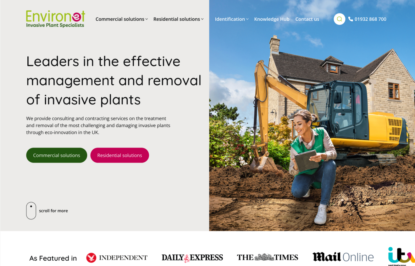
Before
Key Conclusions and Statistics
- Enhanced User Experience: Through meticulous development efforts, we achieved a significant enhancement in user experience, resulting in smoother navigation and increased engagement.
- Improved performance: Our development interventions led to notable improvements in website performance metrics, including faster load times and reduced bounce rates.
- Optimized responsiveness: By implementing responsive design principles, we ensured seamless accessibility across various devices, enhancing the overall user experience.
- Strengthened security measures: Robust security protocols were implemented to safeguard the website against potential threats, ensuring data integrity and user privacy.

"Thanks to Hyroes' expertise, our website now reflects our brand's values and has significantly boosted our online visibility."
Emily Grant
Director of Operations, Environet

Sigmatix: Elevating Client Base to Upscale Sector with $100k+ Revenue Companies
